It’s been long awaited but we’ve finally done it! We’ve changed our logo! We are happy to finally showcase it and will slowly start to adopt it over time.
Autoterm is moving forward That is why we chose to “face-lift” our logo. We continue to develop products, employees and our thinking is constantly moving forward. The new logo showcases our future road for our company, products and mental approach to business.
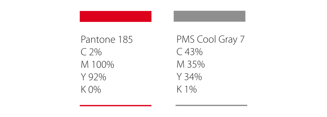
Our new colors Why did we choose the vibrant red & mechanical grey color?
Red – in connection with heating
Grey – in connection to our seriousness & automotive sector
Respect for our past We have not changed the concept in the logo fully, because Autoterm has been and will continue it’s path with autonomous heating systems. As of 2012 our logo has always held a “Star” and Autoterm name. We have deep respect for our story and those who helped us to grow. At Autoterm we look forward to our more simplistic approach but with innovative mindset to solutions & our heating systems.
Refreshing change It aims to reflect our positive, fresh approach, professionalism and experience as well as give us a previous brand recognition and attractive corporate look.
We are delighted with our new logo and hope you like it too.

 Partner Login
 Products
 Find Local Partner
 Become a
  3-Year Warranty


 autoterm-europe
